Saturday, 26 November 2011

Ae work


Here is a screen shot of my splash screen I made up in After effects, ended up having to make numerous compositions into order to fufill the desired effects in the animation. Some containing over 60 layers..... Madness


Still of iphone splash screen
Still of ipad splash screen

Monday, 21 November 2011

Illustrator Mock ups for 15 sec intro animation

 Here are the still mock ups for my 15 second intro to my Malibu app design;

I have chosen to go with a vector based design with simple bright graphics that would help sell the
Caribbean style, I also wanted to have fun making the app look fresh and up to date by having a heavy but

appealable look to the app.
 
Still 1
 
Still 2

 
Still 3


Still 4


Still 5
 
Still 6


Sunday, 13 November 2011

Malibu Research

To help me get a better understanding of the brand that I making my app for, I decided to do some research on them and their existing products and graphics.


Malibu Logo


As the existing logo for Malibu is bright and bold, I will reflect this in
my design. I would also like to use palm tree's as the rum is based on 
the Caribbean and this will help represent this.


Malibu game app


This is an existing game app by Malibu, the graphics are bright and it is based
on the idea of rum shacks, again representing the Caribbean and the focus of 
the brand.


Facebook


The above and below shots are from the Malibu Facebook. Again I
think these highlight the tropical, fresh, fun feeling of the Malibu brand
and I hope to replicate this feeling in my own design, so it would fit in
well with the existing marketing material and apps already created. 


Saturday, 12 November 2011

iPhone and iPad sizes

My finished prototype must ensure that it fits to the dimensions of the iPhone and the iPad. To do this this the dimensions must be as follows:

The iPad has a 1024px by 769px screen resolution


The iPhone 4 has a 960px by 640px screen resolution

Gestures

iPhone's and iPad's are both fully touch screen. This is important to consider for my design as these gestures could be incorporated into my app as part of the game. This use of movement is used for zooming in on photo's, playing games and viewing web pages. 


Here is an example of the gestures that the devices are capable of;


This app is an example of using gestures.You move the phone and the content on the screen moves as a response. For my design I may use gestures, for example I may use a shake action as part of my game, to make it more interactive and interesting for the consumer.

Tuesday, 8 November 2011

Research Focus: Angry Birds

Angry Birds, is a simple catapult stlye game when you take on the role of bird vs pigs, the idea is to launch your birds as projectiles against a pig infested fort, this simple yet addictive game became a mass international hit - now boasting a staggering 300 million plus downloads, with millions of minutes played worldwide per day.

Why i chose to comment on angry birds is due to its simple graphics and addictive game play that I intent to try and emulate in some way in my work to come.

Angry birds have a very distinctive theme that is highly recognisable
this has drastically helped towards the success of the game app.

These stills show the ingame graphics displayed whilst playing angry birds
, i like the simple clear imagry used.

Again another ingame still that shows some of the versatility of the artwork

This image shows a splash screen, I like the use of icons rather than text, this
helps keep the image simple and make the buttons far for appealable.

Sunday, 6 November 2011

Research: Drink App Menu's

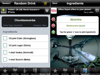
For my app, I need to consider what sort of menu I will use. There are different styles which give different looks and here are some examples of existing menu's. 


With this menu you would use your finger to rotate the list to find the drink 
that you would like to view. I like the use of this type of menu, but it may not
work on my app, as it will be much more graphics based so may need a more
simple style of menu.


This menu is simple but effective, in list form. I may use this sort of list. I also like
the icons at the bottom of the screen and the use of graphics along with words. I 
would like to use more graphic based symbols like the ones in this menu as I think
they are more simple to follow and easy to glance down and see exactly where
in the menu you would like to be.


Research: Drink apps continued

I like the layout of this app, as I think it looks neat and ordered well. However
I think the colours lack lustre and do not really reflect the product that the app is 
promoting. I think the colours would need to be brighter and bolder and maybe 
give a more tropical feeling, due to the drinks being cocktails. 


Again, this app has a good layout and looks tidy and easy to follow. But it isn't eye catching
enough and I don't feel like it would invite the consumer into wanting to use it. The
colours and graphics in an app need to encourage people to want to use it and the above
apps don't do this.

Research: Drink Apps

In order for me to create my iPhone app, I decided it was necessary to do some research into existing drink apps, so that I could see what makes an app successful. The following drink apps are what I feel to be aesthetically pleasing and I could consider using aspects of these for my own design.


This app works well due to it's clean graphics and neutral colour scheme. 
The colours aren't too over powering and compliment each other. I also like the
use of 'choose your mood' and how once the button is selected it changes 
colour, this is something I would like to use for my own app. 


I like the use of icons at the bottom of this app, I would like to incorporate the
use of a skip button and other icons on my design. Again in this app I like the use
of colour, the red shade represents cocktails well as it is a colour that features
regularly in the drinks. 


In this app, I like the use of wording 'drinkspiration' as it is inviting to the consumer
and is enticing. I may consider using word play in my own app as I feel it would
engage the consumer more and make my app seem more interesting.  

Thursday, 3 November 2011

New Brief: App design


For this assignment, you will devise and design an app for iPad and iPhone which promotes an alcoholic drink brand of your choice.  This needs to feature a 15 second introductory animation/motion graphics sequence (which you will allow users to skip) followed by an interactive app which offers users something useful, informative or entertaining related to your chosen brand. 
You will look into alcohol brands and advertising, and undertake broader visual research, which enables you to design a graphic style for use in the animation/motion graphics and app with a cultural focus and set of values suitable to your brand.  You will use the imagery you devise to create interesting and imaginative visuals that bring the branded identity to life.  You will choose a piece of music to work with for your animation/motion graphic sequence which corresponds to the visual theme which you can animate your piece to, and produce storyboards and an animatic which plans your sequence.  You will use After Effects to produce the finished piece.
You will research a range of apps for iPad and iPhone, and devise ideas for your interactive sequence.  You will research interface/interactive design for iPad and iPhone (including usability and gestures) and design your interactivity according to these findings.  You will plan the content of your app and produce relevant design planning document (including flow diagrams, wireframes, mock-ups).  You will also undertake technical research related to design for iPad and iPhone (including resolution/pixel dimension issues). 
The final outcome for this assignment is a prototype of your app which you could pitch to your client, not a fully functioning app running on the iPad and iPhone.  This prototype must feature a finished animated introduction and a demonstration of the app mocked-up into an iPad and iPhone graphic shell.  This client pitch will take place in class on Wednesday 7th December. 

As part of the process of designing this animation and app, you will pitch your ideas and work in progress to the group and your tutors for feedback. You will prepare a presentation in which you show your visual, content and technical research (to help you justify your design solutions), storyboards and animatic (using your choice of music), plans for interactivity (such as wire frames and flow diagrams), mock-ups of artwork and app interface and content.  Any work you have in development can be shown also in this pitch, which will take place in the class on Monday 21st November.  


For this brief I will have to make a convincing pitch for an iphone/ipad app, for an alcoholic drinks company of my choice, this pitch will have to include a 15 second animation as well as another part to show the interactivity and ability of what the app could do. First impressions are that I think i'm going to go for a bright and fun company so as to make a more fun and exciting app