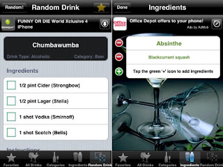
I like the layout of this app, as I think it looks neat and ordered well. However
I think the colours lack lustre and do not really reflect the product that the app is
promoting. I think the colours would need to be brighter and bolder and maybe
give a more tropical feeling, due to the drinks being cocktails.
Again, this app has a good layout and looks tidy and easy to follow. But it isn't eye catching
enough and I don't feel like it would invite the consumer into wanting to use it. The
colours and graphics in an app need to encourage people to want to use it and the above
apps don't do this.


No comments:
Post a Comment