Friday, 20 January 2012

The Brand - Swarovski


Above is the Swarovski logo, which is delicate and quite simple. The colour is neutral and doesn't particularly stand out. This would suggest that the brand would like to be known as elegant and professional as it's logo has quite a corporate feel to it. If I choose this brief then my approach would have to be completely different to the 'feel good' brief. My campaign would have to be serious and more formal as this is the message the brand are trying to convey.


As can be seen in the above images, the branding of Swarovski is very traditional and clean cut and the type is also kept simple. My campaign would have to consider this traditional approach, as producing something too abstract would not fit the brand and wouldn't match the products I would need to promote. The colours are kept more neutral and the picture above seems to be playing on the idea of natural beauty, something that could be said of the Swarovski crystal, this is something I could incorporate into my designs. 


As Swarovski particularly want to appeal to a younger audience, it would be wise to use the above to ranges to appeal to the given target audience. It is very fashionable at the moment to wear Disney jewellery as can be seen on websites such as ASOS and their Disney Couture range. To fit in with current trends, these ranges would be perfect to bring new young customers to the brand and would definitely be much more appealing than the more traditional Swarovski pieces. 


The Brand - The Feel Good Drinks Company

To help me understand more about the task in hand, I decided to have a look at the brands and see exactly what they are about. I began by looking at The Feel Good Drinks Company website.


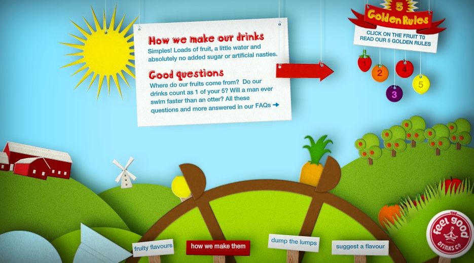
Immediately on accessing the website it was easy to establish the feel of the company, particularly with the use of the above 'feel-good-o-meter.' The approach used to advertise here is light hearted and humorous. The type is rounded and friendly and you are instantly drawn towards it. It was obvious by this that if I was going to pursue this brief then I would have to take the same tone to fit in with the way the brand advertised themselves.  


The colours used here and bright and bold, again giving a light hearted, less serious feel which is necessary when trying to attract the target audience. The use of the sunshine suggests happiness and fun, exactly what makes you 'feel good.' The graphics used are vectorized and clean, again something to consider when designing for the brand, it's important that my designs would reflect the brand and not go too far away from what they already are.


Again this above image highlights the soft, fun feel to the company and emphasizes the feel of the brand.


Above, a sugar cube character has been used to represent the lack of sugar in the drinks. This would be a good theme to use for one of my designs as the company is keen to make it known about their lack of sugar in the healthy drinks.


Wednesday, 18 January 2012

YCN Brief


I wanted to chose a brief that was relatively open and allowed me to be unrestricted in my creativity. Having read all the briefs I decided that the following two briefs would fulfil this criteria and I began to explore both before making a final choice on which brief I would choose. 


The Feel Good Drinks Company

The challenge

One word. Awareness.
We know that when someone tries one of our drinks, they’ll give it a big thumbs up. The trouble is, not enough people know who we are. So we’re looking for creative ideas that will dramatically raise awareness of our drinks, and just how darn tasty they are. 

Brief 1

Make us famous.
Communicate 3 simple things: our brand name, what our drinks look like and that our drinks are full of natural fruitiness.

Brief 2

Fruit not sugar.
We know you can make great tasting natural juice drinks without adding sugar – we do it everyday. We think that when someone chooses a healthy drink they don’t want or expect it to have heaps of sugar in it. We want you to come up with an idea that tells people the facts.

Creative Requirements

Often the best ideas have the potential to work across all manner of channels. Do consider all types of new and traditional media, including on-pack and even point of sale if you want to.The idea is to spread the word, focus on our small bottle still and sparkling juice drinks.

Target Audience

16-34 year old adults who are happy to pay a little bit more for a healthy, tasty soft drink that isn’t full of junk.The message should always be friendly, fun, and just a little bit cheeky.

Swarovski

Attract the next generation of Swarovski fans

The aim of this brief is to take the repositioning of the brand to the next level, concentrating on attracting the next generation of Swarovski fans to our fashion collection.


Target audience

Swarovski are interested in reaching a new younger audience (20 – 30 year olds) primarily targeting young urban UK females who love their jewellery, like to keep up with the latest trends and fashion, and want to express themselves through their jewellery.

The creative challenge

We’d like you to creatively demonstrate how you think Swarovski can relevantly and powerfully engage their fashion range with younger UK consumers. You are free to explore all marketing channels, demonstrating the media and environments that you think the target audience will be most receptive to messaging and engagement.
This is deliberately a very open brief, and you’re encouraged to approach it creatively and freely.

Creative Requirements

Your work should fit within the Swarovski brand identity.

Wednesday, 7 December 2011

Animation stills

Here are some stills from the animation, they dont give justice to the method of change between them but give the general look I went for with the promo app. They also show the cocktail menu


 For my menu screens i used a driftwood looking board I made in Illustrator and had them come in and off screen with an ease effect


I also created a mock shake by keyframing with the rotation transform with the anchor point set in the Iphone button, this was the simulate a projectile charging feature I wanted in the game.


 For the cocktail menus I went for the back board I had used for the display screens but set them out in an easy to use manner with large text and touchable buttons, wanted to reduce the time the player need to read.

The idea would be to have cocktails given as rewards to expand the one already given.


Saturday, 26 November 2011

Ae work


Here is a screen shot of my splash screen I made up in After effects, ended up having to make numerous compositions into order to fufill the desired effects in the animation. Some containing over 60 layers..... Madness


Still of iphone splash screen
Still of ipad splash screen

Monday, 21 November 2011

Illustrator Mock ups for 15 sec intro animation

 Here are the still mock ups for my 15 second intro to my Malibu app design;

I have chosen to go with a vector based design with simple bright graphics that would help sell the
Caribbean style, I also wanted to have fun making the app look fresh and up to date by having a heavy but

appealable look to the app.
 
Still 1
 
Still 2

 
Still 3


Still 4


Still 5
 
Still 6


Sunday, 13 November 2011

Malibu Research

To help me get a better understanding of the brand that I making my app for, I decided to do some research on them and their existing products and graphics.


Malibu Logo


As the existing logo for Malibu is bright and bold, I will reflect this in
my design. I would also like to use palm tree's as the rum is based on 
the Caribbean and this will help represent this.


Malibu game app


This is an existing game app by Malibu, the graphics are bright and it is based
on the idea of rum shacks, again representing the Caribbean and the focus of 
the brand.


Facebook


The above and below shots are from the Malibu Facebook. Again I
think these highlight the tropical, fresh, fun feeling of the Malibu brand
and I hope to replicate this feeling in my own design, so it would fit in
well with the existing marketing material and apps already created.