
Immediately on accessing the website it was easy to establish the feel of the company, particularly with the use of the above 'feel-good-o-meter.' The approach used to advertise here is light hearted and humorous. The type is rounded and friendly and you are instantly drawn towards it. It was obvious by this that if I was going to pursue this brief then I would have to take the same tone to fit in with the way the brand advertised themselves.

The colours used here and bright and bold, again giving a light hearted, less serious feel which is necessary when trying to attract the target audience. The use of the sunshine suggests happiness and fun, exactly what makes you 'feel good.' The graphics used are vectorized and clean, again something to consider when designing for the brand, it's important that my designs would reflect the brand and not go too far away from what they already are.
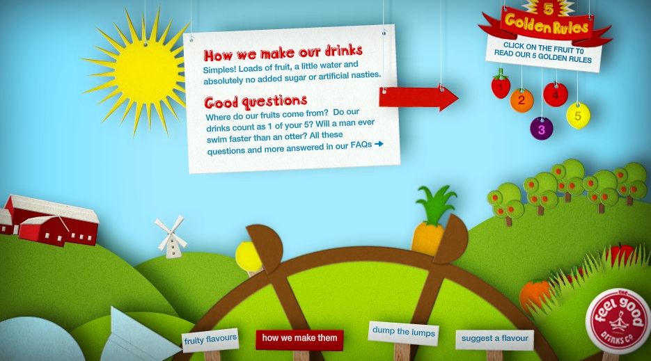
Again this above image highlights the soft, fun feel to the company and emphasizes the feel of the brand.

Above, a sugar cube character has been used to represent the lack of sugar in the drinks. This would be a good theme to use for one of my designs as the company is keen to make it known about their lack of sugar in the healthy drinks.
No comments:
Post a Comment