I wanted to chose a brief that was relatively open and allowed me to be unrestricted in my creativity. Having read all the briefs I decided that the following two briefs would fulfil this criteria and I began to explore both before making a final choice on which brief I would choose.
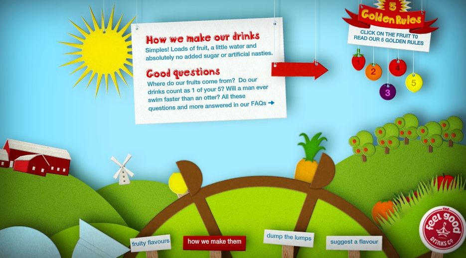
The Feel Good Drinks Company
The challenge
One word. Awareness.
We know that when someone tries one of our drinks, they’ll give it a big thumbs up. The trouble is, not enough people know who we are. So we’re looking for creative ideas that will dramatically raise awareness of our drinks, and just how darn tasty they are.
Brief 1
Make us famous.
Communicate 3 simple things: our brand name, what our drinks look like and that our drinks are full of natural fruitiness.
Brief 2
Fruit not sugar.
We know you can make great tasting natural juice drinks without adding sugar – we do it everyday. We think that when someone chooses a healthy drink they don’t want or expect it to have heaps of sugar in it. We want you to come up with an idea that tells people the facts.
Creative Requirements
Often the best ideas have the potential to work across all manner of channels. Do consider all types of new and traditional media, including on-pack and even point of sale if you want to.The idea is to spread the word, focus on our small bottle still and sparkling juice drinks.
Target Audience
16-34 year old adults who are happy to pay a little bit more for a healthy, tasty soft drink that isn’t full of junk.The message should always be friendly, fun, and just a little bit cheeky.
Swarovski
Attract the next generation of Swarovski fans
The aim of this brief is to take the repositioning of the brand to the next level, concentrating on attracting the next generation of Swarovski fans to our fashion collection.
Target audience
Swarovski are interested in reaching a new younger audience (20 – 30 year olds) primarily targeting young urban UK females who love their jewellery, like to keep up with the latest trends and fashion, and want to express themselves through their jewellery.
The creative challenge
We’d like you to creatively demonstrate how you think Swarovski can relevantly and powerfully engage their fashion range with younger UK consumers. You are free to explore all marketing channels, demonstrating the media and environments that you think the target audience will be most receptive to messaging and engagement.
This is deliberately a very open brief, and you’re encouraged to approach it creatively and freely.
Creative Requirements
Your work should fit within the Swarovski brand identity.