Today we each of the groups pitched their final design ideas for each of the three areas, graphics, video and web. Thankfully the client liked all of the groups presented ideas and work, and agree with most of what was said.
This allows us as the graphics team to carry on pursuing the route we had started, Now our focus is on finishing all the general layouts of each of the elements we are required to produce, and acquiring a photo for the background image which Caroline has opted herself to take over the Easter break.
Wednesday 28 March 2012
Tuesday 27 March 2012
Poster Idea version 2
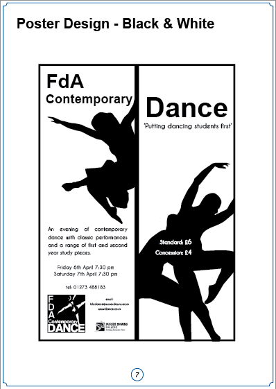
Using an image the graphics group found online, that had a dance pose we were interested in using I made a new composition. For this version and its slightly different edition I added some mock quote areas and added the Sussex downs uni style logo and shrunk down the new FdA dance logo. Having a dance pose seems to be more successful than the picture of just the girl standing.
I found when I lowered the colour saturation of images slightly it added a 'on the red carpet' (best way I can think of describing what I mean) kind of look so I chose to keep them
that way to show the group.
 |
| In this version the two extra logos at the bottom have been removed I did this to have a version with less clutter at the bottom to show the group. |
 |
| In this version the telephone number has been made a little larger and more spaced out |
Revised Poster Design
For the pitch on Wednesday I offered to have a crack at redoing the layout of the text at the bottom of the poster design. I decided to change the font to a mixture of Steel Tongs and Steelfish. These fonts have a stretched look that helps it look suited to the information cramming that is going on. It was also suggested that the college and uni logos could be made smaller, so in this case I shrunk them down to fit in the same space as the words.
 |
| for this design the background image has be kept the same as the previous edition |
Saturday 24 March 2012
Revised Leaflet Mock-up Design
Thursday 22 March 2012
Further Poster Mock
Caroline and Fiona worked on combining elements of different mock-ups together so that one mock-up could be made to be reviewed by the client.
Although the image used in the mock isn't the one the graphics team want to use, we have to wait till a more appropriate photo can be taken. As a group we are currently in discussion about what pose and style of image would be suit our mock-up design
Wednesday 21 March 2012
Poster Re-design Mock-ups
Below are Poster mock-ups (there are more but I don't have them to put up sorry Caroline and Saci) that we discussed as a group.
For this poster I mixed two photos taken by the Video group to try and create an image that was easier to use, Although the dance pose isn't striking enough, but helped in showing my idea of a potential layout.
This Mock-up the graphics team decided had the most promising content layout at the bottom. Unfortunately the college branding guidelines require both the college and uni logos to be situated at the bottom of the poster.
Tuesday 20 March 2012
Mock-up Logo Designs
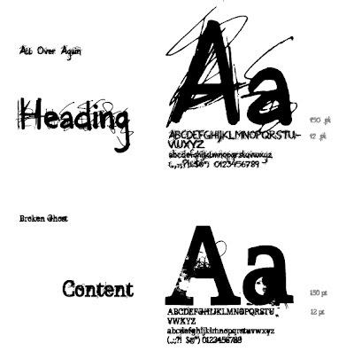
Here are some new mock up designs of logos developed by the Graphics team using the some of the font choices that the client went for.
These designs contained both the choices of font that client like the look of. Design by Fiona
These are similar to the one above but with a different lay out. Design by Fiona
This design also uses both fonts as well, I find that the Broken Ghost font is not as distinguishable as needed as it nearly blocks out the 'a'. Design by Saci
I like the layout of this design, the fda could be a little smaller and the Dance a little larger but the overall composition is good. Design by Fiona
For this design I kept the fda and dance in a clear easy to read font and made Contemporary in the 'All Over Again', I like the look of this design and it fit the poster mock I have made up but may not be what the client wants as both the fda and dance are in a clean typeface. For this reason we are looking to submit a few of these designs with a few modifications to layout and font size.
Sunday 18 March 2012
Logo Re-design
Below is my new logo design, I used the font that the client liked as the font used to emphasize the contemporary but kept the fda and dance in Arial.
Saturday 17 March 2012
Client Logo Ideas
 |
| Logo design by Caroline Floor |
This was a one of the logo designs that the client liked, there response was that they wanted the logo to have space. Although the FDA should not be the largest element of the design.
Research: Promotion Material and Web
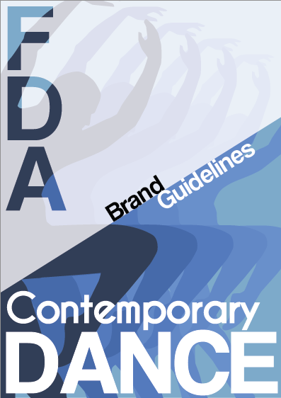
Having received feed-back from the client it is becoming apparent that the preferred look and feel of the promotional material is to be primarily photo based. The clients choice in brand guidelines showed that photo based posters with a spacious feel were preferred. In light of this I looked for other poster online that had large photo images as their primary focus.
Here are a few posters with a photo image as the main part of the composition.
 |
| http://www.vam.ac.uk/content/articles/l/london-contemporary-dance-theatre/ |
 |
| http://www.thangdaodancecompany.com/cdf/cdf-past.html |
Friday 16 March 2012
Research: Promotion Material and Web
 |
| http://www.theplace.org.uk/lcds |
Although I'm not part of the web team it helps to see how the sites are laid out and the way the images are used, especially if the client has opted to have the site as a reference for ideas.
Below are some other stills of sites that I thought represented either simple and spacious or a good use of imagery.
 |
| http://www.cdd.ac.uk/affiliate-schools/lcds/ |
 |
| http://www.city-academy.com/ |
 |
| http://www.sylvera.co.uk/ |
Thursday 15 March 2012
Client Feedback
We received feedback from the FdA contemporary dance unit, as it stands it is a bit vague but it is clear they want illustrative typeface and a simple word only logo. They were also fond of my group coordinator Caroline's web site design and logo font choices.
It is good that some choices are becoming more clear, even though none of my style choices were opted for it help to know that they can be checked off and not used, thus helping us more with the design of the promotion material as we are getting a clearer picture of what and what not to do.
It is good that some choices are becoming more clear, even though none of my style choices were opted for it help to know that they can be checked off and not used, thus helping us more with the design of the promotion material as we are getting a clearer picture of what and what not to do.
Tuesday 13 March 2012
Research: WordPress
The web group is looking to create the web site using WordPress. Here is an explanation about wordpress found on: www.wordpresstemplates.com
What WordPress is:
WordPress is one of the best Content Management Systems (CMS) with heavy emphasys on blogging. It is written purely in PHP and uses a MySql database. The name WordPress was suggested by Christine Selleck, a friend of lead developer Matt Mullenweg. WordPress releases are usually code named after known jazz musicians starting with Version 1.0. Version .70 was released on May 27th, 2003 and contained the same file structure as it's predecessor, b2\cafelog.
I had a look at some examples of the different templates that can be used and found that there is a huge and diverse range allowing for a wide range of choice for the web group team. Here is an image with a few example of the diverse range that can be found.
Friday 9 March 2012
Subscribe to:
Posts (Atom)


